This semester I am enrolled in a book arts and mixed media course. We just completed our first assignment which was to design and bind a sketchbook to be used in our coursework.

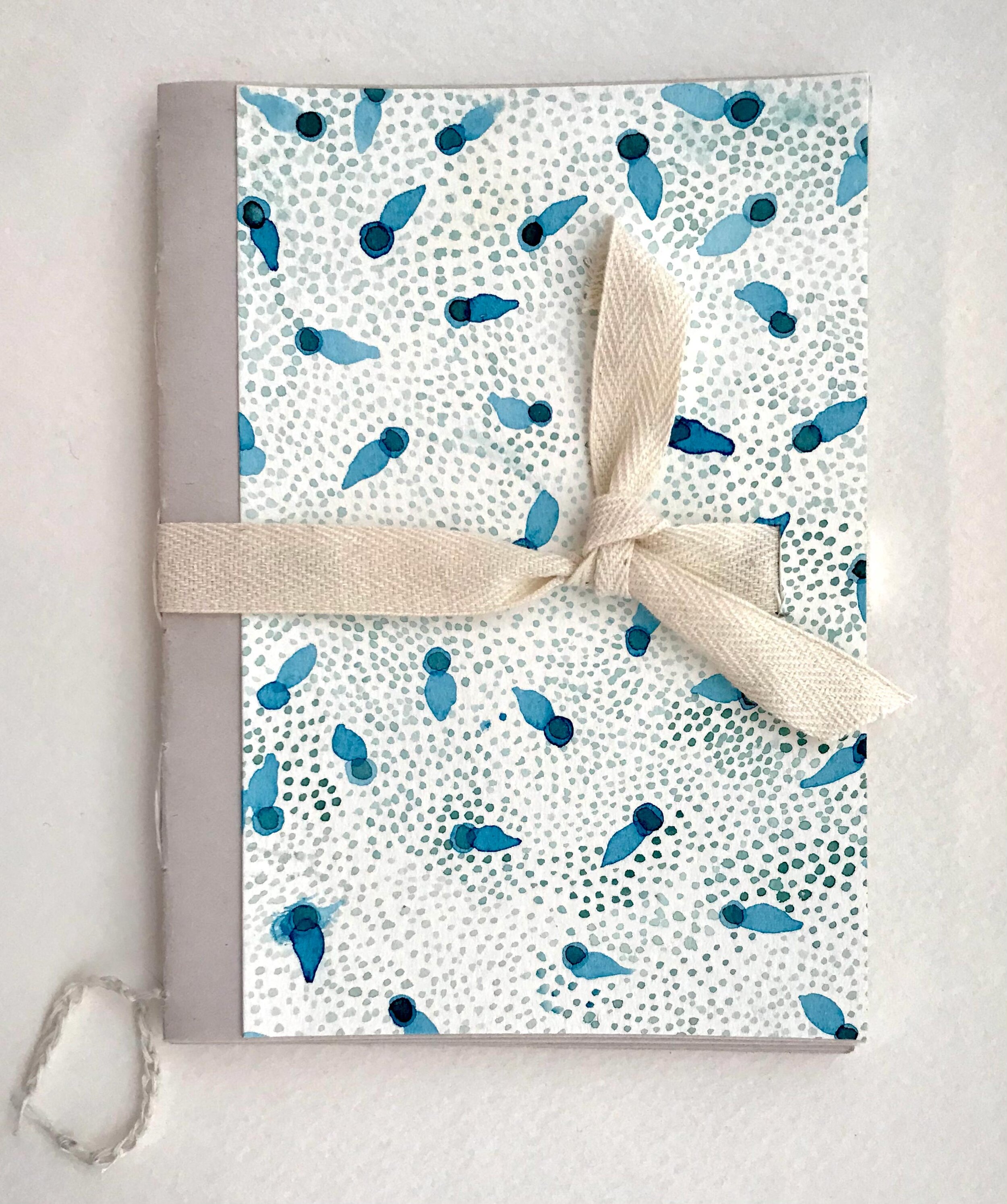
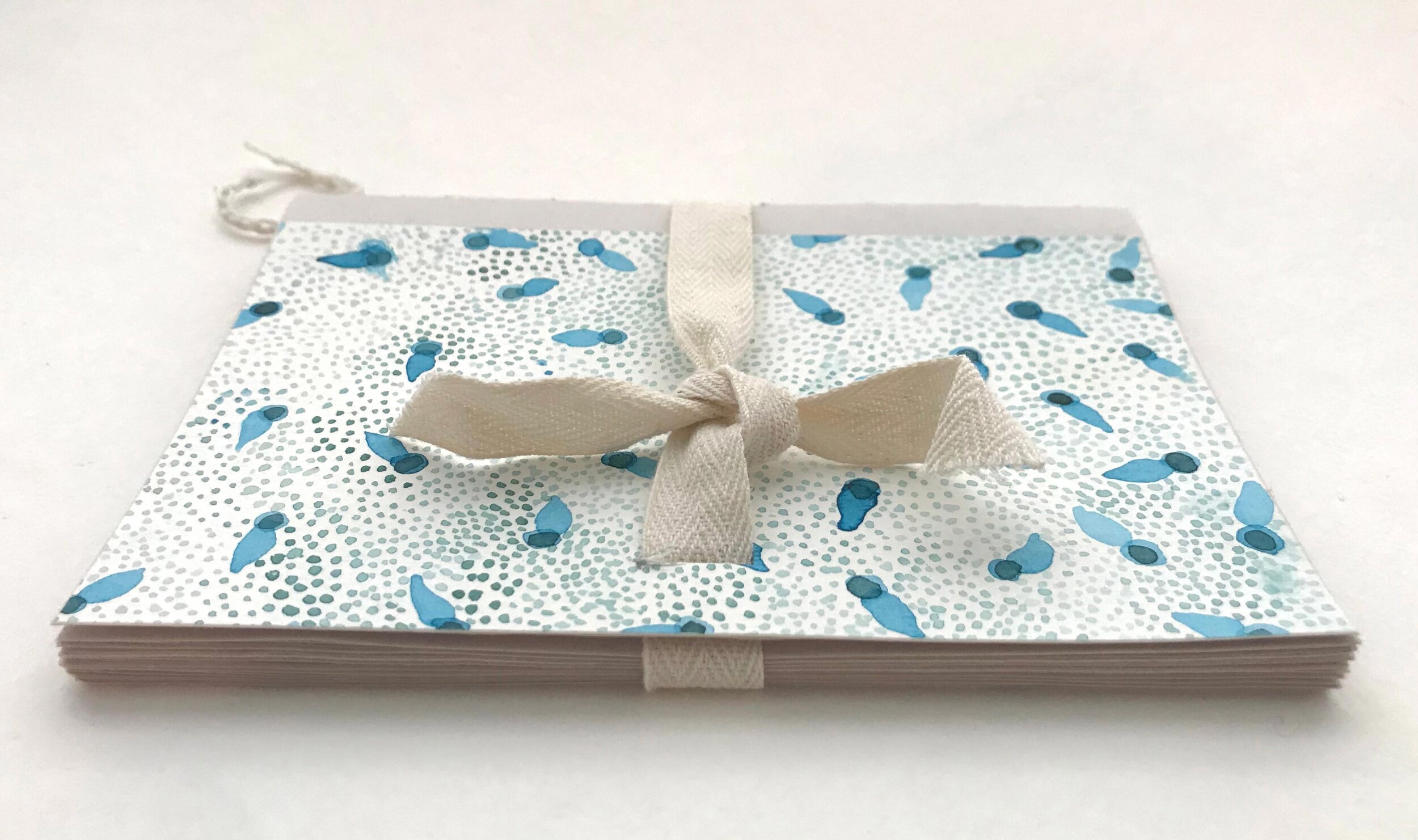
Before sewing together my final project I practiced the French link and kettle stitches on this little watercolor dummy. The cover is a hand painted scrap left over from a fabric design project. I found this YouTube video demonstration of the stitches very helpful: French Link Stitch by Sea Lemon.
My professor’s advice, “Don’t be a dummy, make a dummy” proved to be very good advice!
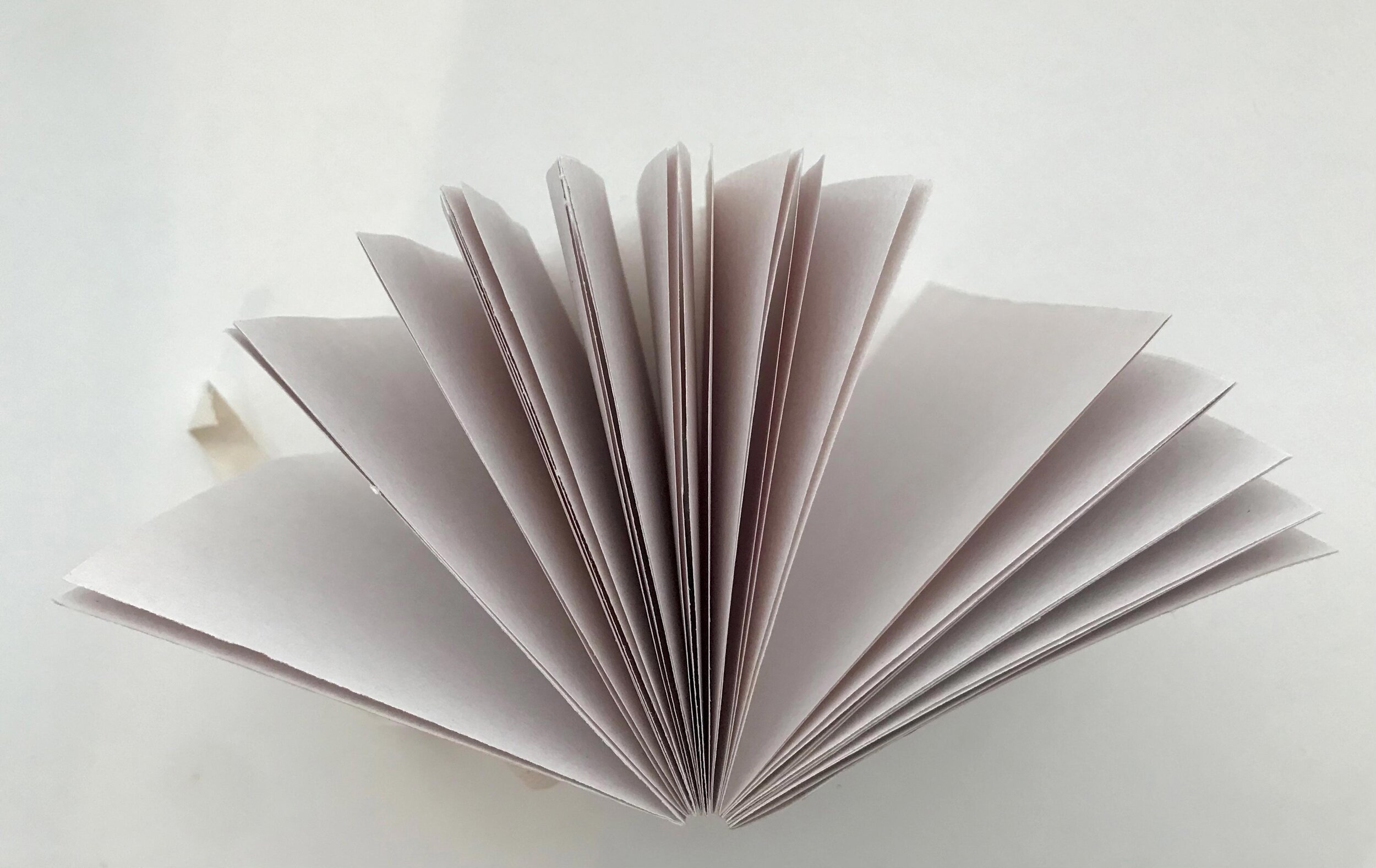
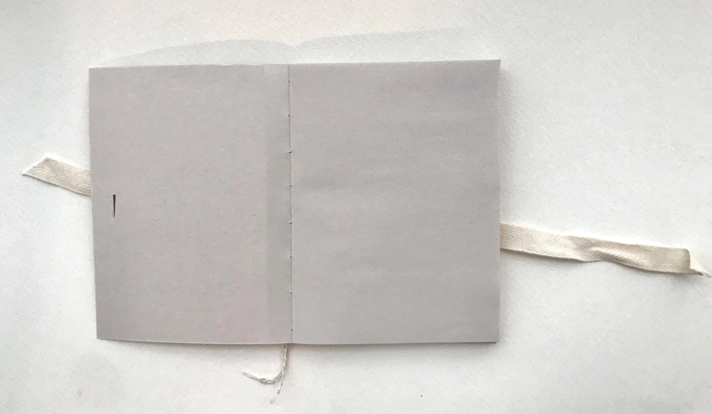
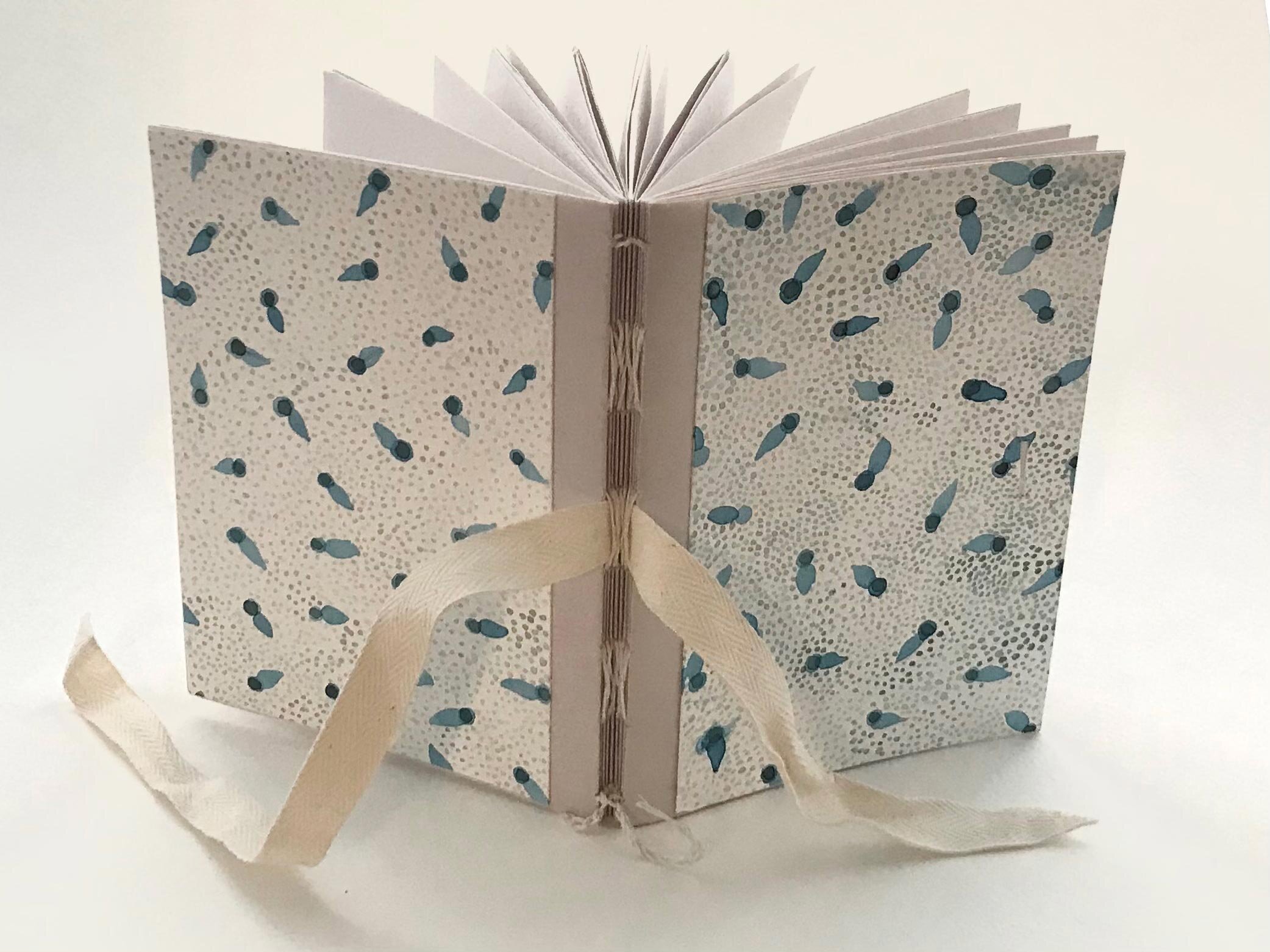
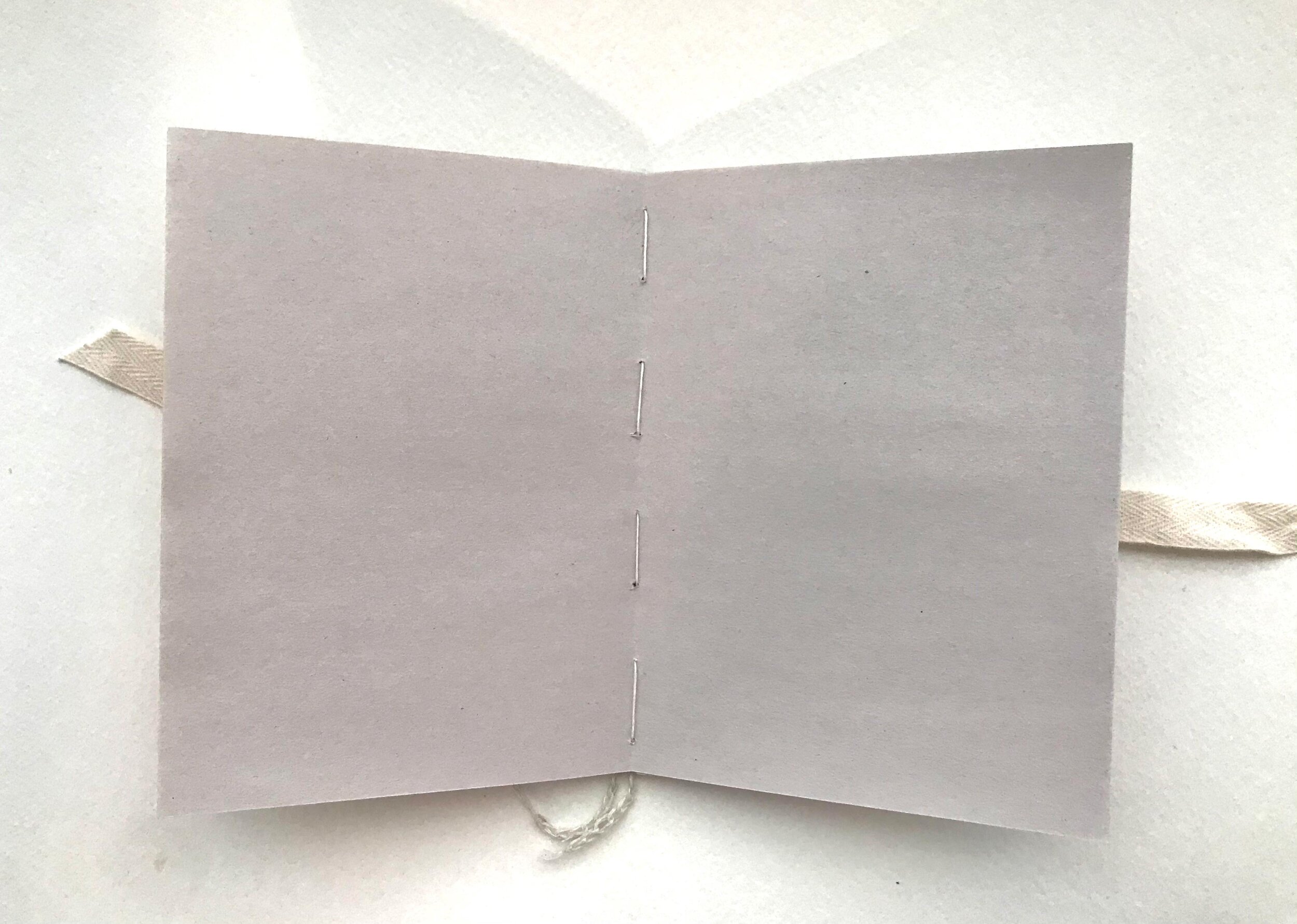
Below are the final photos of my sketchbook project. and I am well pleased with everything except the looseness of the pages. I am considering using a thin layer of PVA or hide glue on the spine to bring a bit of firmness to the spine area.
Possible ways to improve the sturdiness next time:
A sturdier form/clamping system when sewing
A thinner needle
Perhaps thinner thread
Stronger paper which might withstand firmer stitching
Changing the cover design to strengthen the binding
Try a new stitching pattern
I decided to organize my sketchbook around the class assignments creating a signature for each assignment and the proposed paper explorations. I chose a variety of simple papers of varying shades of neutrals (nothing precious). For interest I chose not to make all of the papers the same dimensions. This along with transparency creates a layered interest inside the book:

The outer newspaper strip serves as a title/banner for over a transparent marker paper that lets you peek into the project interior. The lined paper is from a disassembled vintage spiral notebook. I chose to flip the holes to the right for a bit of surprise and to form a visible border. The lined page will provide a place for the project summary. The newsprint is perfect for sketches while the nicer white drawing paper will feature the final project. The later half will provide a place for a reflection and a place to note inspiration/references:

I created a special signature at the front and back of the book to feature a bright color on the spine and to add a cover/fly sheet and create room for a Table of Contents. You can see that I also inserted a cut out from a set of blueprints for a vintage shed that I found squirreled away at my in-laws:

I chose to make my book boards narrower than the text block to feature the bright interior paper. The boards are covered with the envelope that the blueprints were contained in. The backside of the envelope had a rust stain from being stacked on something. I thought it would make a great frame for a title or label and you can see from the first photo at the beginning of this post that I took full advantage of that.
