Shuttle(d)
Shuttle migration is the name given to Appalachian generational migration patterns. Appalachia is sometimes geographically and anthropologically divided into two regions - the coal belt (mainly West Virginia and Kentucky) and the wood belt (mainly Tennessee, North Carolina and Georgia). This is an important distinction for this topic because the different regions have different migration patterns. The coal belt migration patterns move toward the mid western steel and automotive industries (Cincinnati and Ohio regions) while the wood belt has a different migration pattern. In this body of work I am only looking at the migration patterns between the a small segment of the wood belt (mainly Western North Carolina) and the piedmont textile region.
I’m narrowing that interest further by focusing on the textile region surrounding the greater Charlotte area. UNCC geography professors Ingalls and Moore conducted a survey of the regions early textile industry in the early 2000’s using old insurance maps. In the seven county region surrounding Charlotte they identified 118 textile mills. Two of those mills are of particular interest to me – Pharr Yarns because this is the mill that my family worked for and the Loray Mill because of the history of the strike there. I recommend the PBS documentary (Re)Made in the Carolinas-Textile Towns about the Kannapolis Loray Mill strike as a short entry into the topic.
For my BFA show I will not be touching on the political history of unions in Appalachia though it is rich research for later. Below I have given each of my projects exploring this migration pattern a section of its own:
Feat of Clay
One of the attractions of moving away into the life of employment, I think, is being disconnected and free, unbothered by membership. It is a life of beginnings without memories, but it is a life too that ends without being remembered.
Wendell Berry
I have composed a short performance/action that deals with my personal experience of shuttle migration. I have made this trip from the piedmont to the mountains on average six times a year - an estimated 270 times. This has become a regular rhythm in my life that I don’t often think about. I left Appalachia in 1994 after receiving a Fretwell Scholarship to study civil engineering at UNCC. Wendell Berry has another quote from his novel Hannah Coulter that says something like, ‘education leads away from home’; that one echoes in my head a lot. I have now lived in the piedmont longer than I have lived in Appalachia but Appalachia will always be home.
In this piece I plant my feet in two native/wild clays - one from each region and walk back and forth 270 times. On each trip I carry a bit of clay with me drawing a line to trace my movement. Gradually the two clays begin to mix/meld in the middle. I am documenting the work with video and photography. I record the entire performance/action beginning with untying my shoes and ending with a ritualistic foot wash.
Composing the Piece
This is a bit of documentary footage of me working out the details of the piece. You will notice my husband and video adviser as I’m learning to think and plan camera angles. I plan for the final piece to be a solitary production.
details of the work so far


questions I’m considering
What is the best length of the action? I prefer that the muddling that happens in the middle to occur much later in the piece. I think the best way to solve this is to lengthen the substrate.
Fabric or paper? Do I keep the substrate as an artifact?
Visual distinction of clay colors. I have one other Appalachian clay that is a deep rich red. I don’t use it as a clay substrate but I do use it as a clay slip and I use it for pigment in other works. The red would provide a greater visual contrast between the two clay bodies and I think make the mixing of the two clays between the two locations more visibly evident and distinctive.
critique and feedback
Erik likes the paper, he likes the wearing away of the substrate itself and also preserving it as an artifact. He discussed ways of discreetly patching/strengthening the piece from behind after the performance so it would be strong enough to hang and be handled. He agrees that the red clay would provide a greater contrast and clarify more of what is happening in the work.
Chengou likes either paper of fabric but agrees that the paper should be sturdier and the length a bit longer. He does not mind that the two clays are of a similar color - the important thing is that they are from the two different locations and what is happening in the middle. He asked if I always took the same route when I traveled. What he was getting at was asking if the path could occasionally vary - this would create a clearer index of my foot in clay. He does feel like that number - 270 is important and that it is good to define that in the work. He felt like this piece was my strongest conceptually for this topic and that there are only a few small details to work out. He also feels like the artifact should be saved and brought into the gallery alongside the video footage. Bringing cultural reference like footwashing into the work strengthens the piece.
In class/group technique the consensus seemed to be that people wanted to see the performance in person and the artifact in the gallery space. Videoing the work is good for my own record or for academic purposes but don’t bring the video into the gallery.
accumulation
this is my 3D drawing project
When I first defined my BFA portfolio work I set the goal of producing three ‘line drawings’ exploring this idea of the repetitive migration pattern considering the route that I travel as the line. I knew that I wanted to work on a much larger scale than ever before and I wanted to stretch this idea of ‘drawing’. I planned to produce two 2D ‘drawings’ and one ‘3D’ drawing. I had no idea when I set that parameter exactly what I meant by a 3D drawing. I just had a vague notion that I would be making a drawing with ‘material’ on some substrate other than paper - or perhaps not on a substrate at all.
I kept coming back to a metaphor that I’ve been playing around with in my head - the similarity of the line of the road, the creek, and the rattlesnake (an important icon/symbol for me). This combined with my desire to create some way to track movements within the gallery space itself and engage the viewer bringing them into or making them a part of the work led to the idea for this project which I am defining as my 3D drawing.
When I first began drawing this line (see my week 3 documentation) not only did i realize that the repetition and the action of the line was important but I began using color to symbolize the back and forth - a color for each direction. Those colors were easily translated into two colors of clay. The images were pleasing but a bit repetitive. I began asking myself what would happen if I used other colors to symbolize specific lines which would correlate to specific life events happening during that year - very similar to how tree ring dating images are created. I really liked this idea as it allows me to begin developing a color aesthetic and palette that is not completely defined by the material.
engaging the audience/experience creation
That image paired with the idea of a token for tracking gallery movements and the similarity of the line of the creek and the road and the popular trend and history of stacking stones led to this piece which I have titled accumulation. There will be one token (shaped like the smooth stones in the creek) for each trip. I will be using the clays, slips and glazes made from my site materials along with a few select other colors. (This red will likely not be included - I was going for a pink. I’ll be reducing the color from a 30% concentration to a 3% concentration.
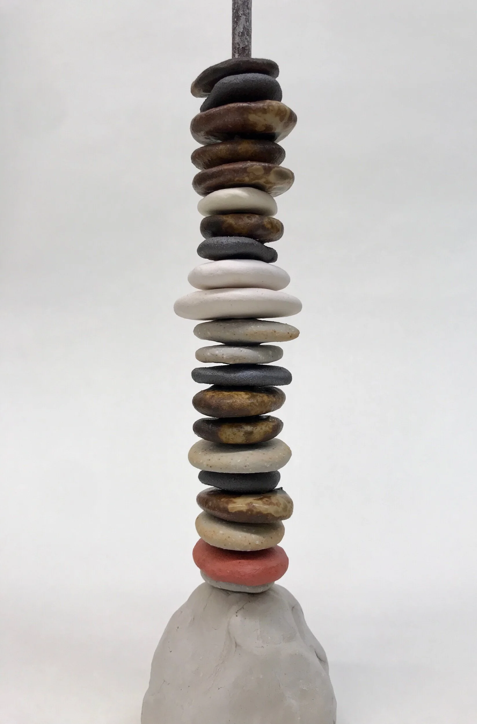

I love the flexibility of this piece. I can stack them all up as a ‘work’ and recompose them or I can use them as an engagement activity in the gallery. I love how this piece relates to those of us who travel back and forth. I can’t think of any of my aunts, uncles, or cousins who don’t have a rock from the creek that sits on their desk or that they carry in their pocket. Many keep them in jars of water so that they have that same richness and brightness of color that they have in the creek. It’s a way of bringing a piece of home with you and carrying it around.
current cultural relevance
My plan for this work was honestly also influenced by the current Migrant X performance. Every night as I worked I was surrounded by a chorus as they rehearsed. It was a reminder that these migration patterns are not unique to me or my family - they are present in many cultures whose people depend on cash crops and low paying jobs; cultures who view education as a way out. I thought about our tradition of ‘call and response’. What if I wanted the viewer to ‘respond’ by placing or stacking a token - what would the call be?
I’ve been developing a list of questions to test and explore. If they ‘gallery migrant’ identified with the ‘call’ they are asked to respond by stacking up a token. These are very roughly worded and only a beginning:
My childhood home doesn’t exist anymore.
I have changed the way that you speak in order to not draw attention to yourself.
I have been misunderstood because of my dialect or accent.
I or a family member has worked second or third shift.
I or a family member has been laid off or out of work for more than 6 weeks in a row.
I have planted or harvested a cash crop.
At some point in my life more than 50% of my food was grown by my family.
I do not consider where I currently live to be my real home.
questions i’m considering
What is my color palette/aesthetic? Developing a surface in clay is not easy! I like that much of my surface in controlled by material but I’m also very conscious of the aesthetic dominance of those colors and textures. I am not interested in all of my work being some variation of a brown/earth color. I am very much interested in bringing the colors and patterns of the textile world (especially in relation to the history of American quilts) into my work at some point. This work seems like a perfect opportunity to do some further material and aesthetic research in a very non intimidating way.
I’m really interested in expressing the full range of my materials in this piece - clays fired a different temperatures for different colors, the same material used as both a substrate/body and also as a slip, exploring some modern and historical slip and glaze recipes. I think this piece has the potential to express that idea of ‘generational layers’ through layers of historical materials - simple slips and ash glazes, primitive American cobalt, and modern commercial underglazes or even stroke and coat glazes.
how do I present that ‘call’ - vinyl on the wall?, text on a tile/form?
What is the form of the piece that is the anchor for the stacking?
critique and feedback
I’ve had an overwhelmingly positive response to this piece - everything from the weight and feel of the ‘tokens’, the attractiveness of how they look stacked, the engagement of participating in a response, the anononimity of the response, the visual feedback of real time data, and certainly not least the pleasing clink of dropping one in place.
Chengou did mention that when exploring the materials and colors that there should be a reason or connection to the work or idea. It was his question/critique that led me to the idea of viewing this as a record of the history of ceramic materials - that same contrast that I am making in other works of commercial and or industrialized materials/processes and subsistence materials and processes.
In class critique this project was well received. There was a positive reception to how I am pushing the definition of a drawing - can any creation/formation of a line be considered a drawing? The participatory aspect of this piece was very well received. My classmates were interested in an actual ‘response’ beyond that of placing a token. Being able to record or capture a story was mentioned. A button to hear the call was also mentioned. One classmate asked for the opportunity to be able to take a token to carry with him, or even an idea that I might encourage taking the tokens to new places.
Clay Body Research
I don’t want to overwhelm this portfolio with my continual material research but I do feel like I have made some very significant progress during this first part of the semester with a working clay body for my thrown forms. Because of how my work is rooted in this idea of ‘place’ I am finding that the substrates that I actually work upon are often more important to me than my materials or processes. I can imagine bringing more modern surfaces and materials into the conversation as long as the substrate has that link to ‘place’ (actually I like that contrast as it relates to the idea of a ‘NeoAppalachia’).
Last semester with the help of Keith I developed a clay body from a native clay which can be thrown but I did not develop any glazes or surfaces that ‘fit’ that clay body chemically. I knew that if I attempted that this semester that research would be the bulk of the semester so I set it aside. So if my throwing body would not be a ‘native clay’ what would it be?
I had several criteria - a white stoneware that would provide enough contrast with my native clay surfaces to show off those marks and decorations; a clay with enough tooth to support throwing the bottle and jug forms that I was interested in, a clay that worked well either in oxidation, reduction or soda firings, and if I could not have a native clay body then I at least wanted a clay body that was historically rooted. I feel like I found that perfect match in a clay body commonly known as Tennessee Nichols which is a white soda stoneware developed by artist and soda expert Gail Nichols:

I went through a couple of recipe variations as the original recipe used a feldspar that is no longer available to us. One of the things that I love about working with soda firing is the number of female ceramicists who have pioneered the medium. Some of the best research and documentation in the field has been carried out by women.
I was happy with this body and it’s potential–and I still love and plan to use it just as it is– but my trip to the Mint Museum Pottery Market set a new set of tests in motion that has allowed me to speed up the process of using my native/wild clays as a substrate in tandem with our studio glazes and other cone 9 and 10 glazes that I have access to. I had conversation with artists Melissa Weiss and Jason Hartness, both who studied at Bandana Pottery which I researched last semester), mix their native and wild clays with a known and predictable stoneware body.
Based on conversations with Melissa I ran a quick series of tests varying the percentage of native clay to my stoneware body. Those came out of the kiln today and I was blown away by the results! All of the experiments worked - I can mix a clay body that has as much as 75% of some of my native clays in it and still be able to fire the pieces to cone 9 or 10. Most amazing of all is that at least some of our studio glazes will fit. (Glazes don’t fit when the shrinkage rate of the body and the glaze or different, or there is a clash of chemistry between the two).

Above you can see this experiment carried out using from L to R 25%, 50% and 75% native Appalachian clay. For this experiment I did not screen out any of the grit, mica, or other organic material and you can see the progression of texture from L to R as the percentage of native clay increases. I often use a white slip in my work and so I tested one of my slips on the body and used it as a mark making exercise.
Below you can see how well our studio white glaze fits the claybody - absolutely no crazing or shivering.

Below is the one test that I ran using 25% of my native Charlotte clay. I did not test higher percentages of this material as I know from previous tests that this claybody only goes up to cone 6 in reduction. Even though these substrates are not 100% native clays I know that all of the color coming out in the firing is coming from the native clays as the claybody itself is white. I have the same potentials with texture as well - I could eliminate the texture from the Tennessee Nichols body and allow all of the texture in the substrate to come from those native clays.
I do really love the speckling that is happening with the iron coming through the white glaze in the interior of the piece below. That is a very traditional look for those times when I want the surface to directly speak to that history of NC pottery.

(I just want to note the string texture here in this piece. This is another bit of surface and material research that I’ve been doing and this is one of my favorite results so far. I am going to try and reproduce it and make sure that it is repeatable.

MillHands
(IF ANYONE READING THIS CAND DO ANYTHING TO FIX THE ISSUE WITH MY ACCESS TO THE PAPERMAKING STUDIO I WOULD GREATLY APPRECIATE IT. I CAN ONLY WORK BY ASKING FOR SOMEONE TO UNLOCK THE DOOR. DURING AFTER HOURS I MUST CALL SECURITY TO GET IN. IT REALLY IS PROHIBIITVE.)
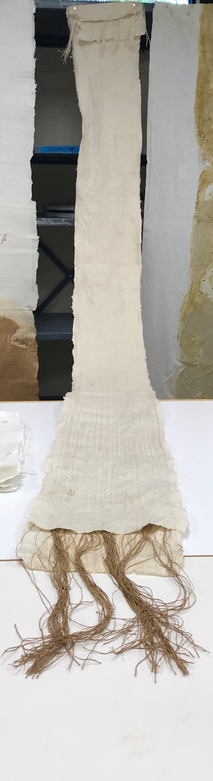
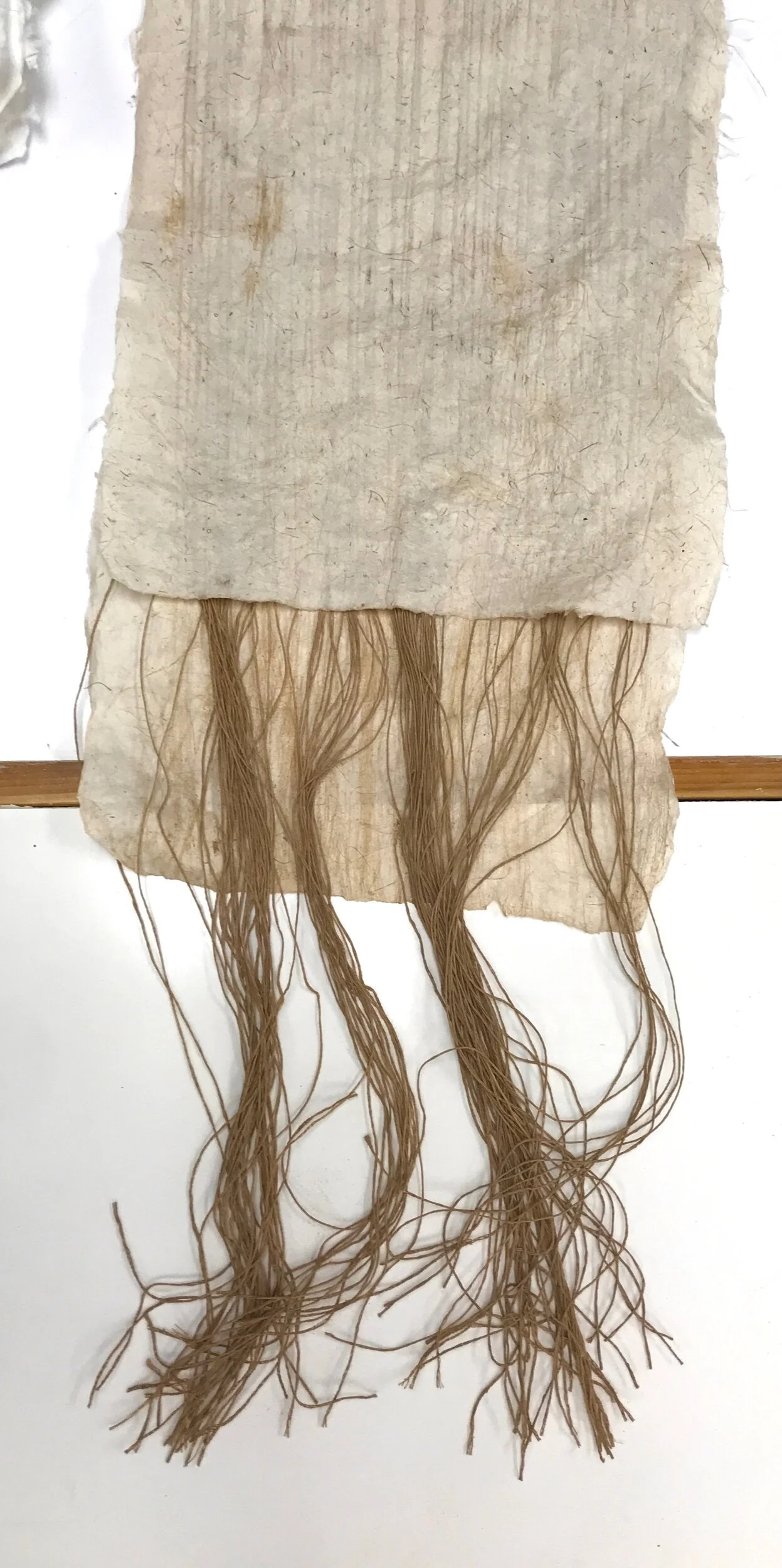
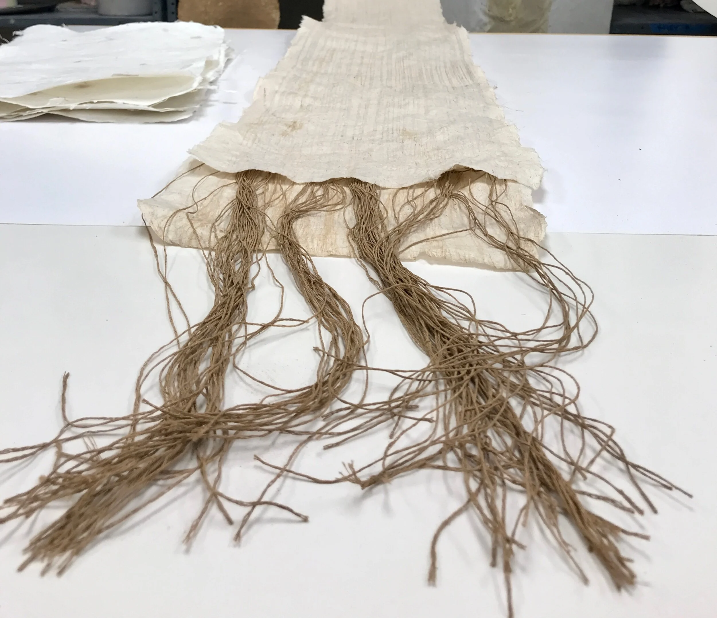
This project is serving as one of my 2D drawings–using linen yarn as the material to express that repetitive line. In this piece I am moving slightly away from the line as a literal back and forth interpretation of my movement and am using this ‘drawing’ as an opportunity to bring the work and the materials into the broader context of piedmont textile mill history.
Once again I’m using the work to present or visualize data or information (In addition to Smithson and Long I am influenced by Edward Tufte). In this piece I am dealing with the specific way that the textile industry historically recruited workers in Appalachia. I am using clay as a pigment to express this transfer of people, capital, and culture out of the Appalachian region into the piedmont. I am attempting to embed 118 threads for the 118 mills in the greater Charlotte area.
Much of the paper itself is made from a native bast material–a weed or wildflower known as Joe Pye Weed–which I gathered this summer and processed and beat by hand. I chose this particular bast material because no other paper maker that I follow has experimented with it before and my observations led me to believe that the fibers in the stems should be suitable - the stems have to be fibrous and strong because the plants can grow as high as 8 feet.


questions i’m considering
Make just a few more adjustments to the process to elevate the craft of the piece. One thing that I might experiment with is to leave the formation aid out of the pulp. Formation aid helps seperate and suspend the fibers but it also makes the pulp hold much more water and remain wet for longer. If the work were less wet it would make the piece much easier to handle.
What about the dimensions of the piece - how long and how wide?
Where, how and when do I introduce the clay slip into the work?
How can I adjust the construction of the sheets of paper themselves to achieve the aesthetic that I prefer - color, transparency, weight, flexibility, visibility of fibers, visibility of threads
critique/feedback
Erik has given me a lot of feedback on the qualities of the paper itself and also on the construction method - especially in the use of sizing.
Chengou also feels this a conceptually strong piece and everything seems to be working together - materials, process, research to exemplify the concept. It’s just a matter of getting the craft to a level that I find acceptable.
Installation Materials


I have been experimenting with materials for a floor installation since the beginning of the semester. My inspiration for this piece is of the scale of the works of Richard Long and Olafur Eliasson. I am finding within myself some resistance to the impact of the removal of such a large amount of material for the sole purpose of my show. This is something I’m still thinking about and exploring.
The gritty/gravelly material that you see in these photographs is all reclaimed material from my harvests of wild or native clays. While I can gain access to more of these materials an installation would most likely not be on the scale of Long or Eliasson. The color differences and changes that you see here is the range of color that is possible within the material itself which can be accessed by changing the firing temperatures. I like that it shows the versatility of the material. I have been thinking a lot about Chengou’s questions about how the color change is connected to the concept. ‘So what if the color change is cool - what does it mean.’
I do like what’s happening here with the contrast of textures when I placed the clay ‘stones’ on top of the line created by the material. The stones are from a mold I made from Appalachian creek stones. It reminds me of the contrast of the creeks between here and there. The slow moving water here does not round and smooth the rocks here - walking in the creek is a very different experience.
questions I’m considering
How big can I feasibly make this? How big am I willing to make this?
Should I mold one rock and show that same rock over and over? Different clays and surfaces or the same?
Should I make several molds, line them up, wind a string/twine through the molds and then make the rocks so that the string or thread connects from one rock to another?
Should I pick one color of material or show a color range?
Do I create a transition of material from one location to another like in Feat of Clay?
critique/feedback
Chengou loves the contrast in material and the connection that the material is what is moved from the clay that is used to make the stones. He questions the intention behind the color change, however.
In class critique these materials were very well received. The feel and texture of the stone especially.
Textile/Manufacturing References

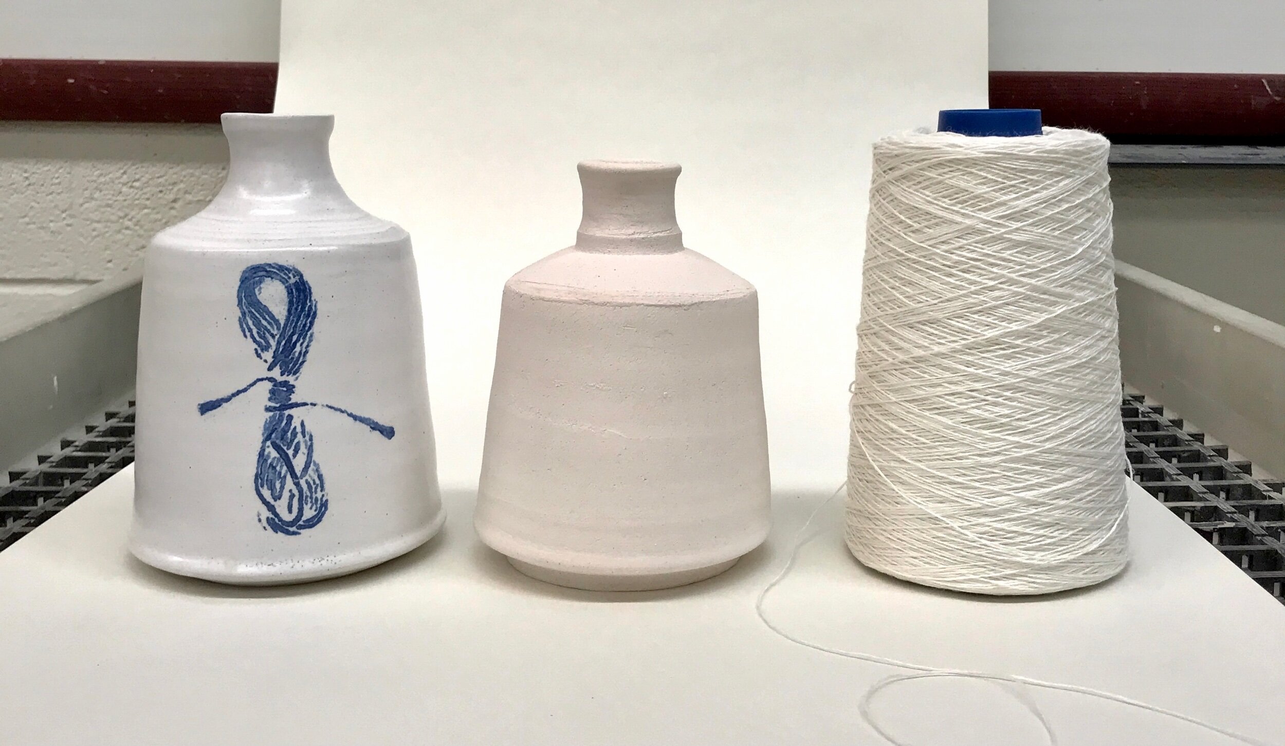


In this project I am specifically focusing on the impact of the textile industry and industrialized processes on the culture and stability of the Appalachian region. The shapes and forms reference textile products - specifically the vessel in the shape of a cone of yarn. In this project I am imagining forcing a traditional NC pottery shape into a new mold.
With this project ideally I would also work in a process that references those industrial processes - using molds and porcelain material. I had never made a mold before so here you can see my first very simple press mold. I would like to make a porcelain mold of this cone of yarn vessel.
The bundles of threads and strings speak to the textile products but also the traditional Appalachian fiber arts. The piece on upper right with the bundle of twine soaked in clay and ‘printed’ onto the paper towel was the original inspiration for this project. Last semester I was playing around with the word ‘soiled’ and put this bundle of fiber in a cup of my slip and left it there all semester. When I took it out and placed it on the paper towel to examine I became fascinated the ‘imprint’ that was left behind.
The other material that you see in this project is cobalt. I’m fascinated by the history of cobalt - it has a long history in ceramics. What I am most I interested in, though, was it’s prevalence in early American pottery and those traditional pottery forms and it’s transition now into a material that we use in lithium batteries. Old tin and nickel mines in places like Canada have been reopened to mine cobalt.
questions I’m considering
critique/feedback
comment from Heather Freeman - consider creating a book to go with the show that talks more about the process and work; it could be for sale.
Chengou - the texture contrast is nice and the fact that the coarse material is screened from the clay used to make the smoother rocks is also nice but the idea behind the color gradient doesn’t meet the same level of intent as the rest of the piece.
Form as a substrate

I want to briefly put together a response here to a question that I’ve been asked about why these forms - why jugs and bottles? First, when you think of NC Pottery these are the forms that come to my mind. Second these forms have ties to the distillation and consumption of alcohol. I have a long family history of moon shining; our family shine was stored and transported in mason jars but these forms were treasured.
I am interested in the history and tradition but not toward the idea of reproduction. This brings me back to this idea of ‘NeoAppalachia’ and what that might mean. I’ve talked a lot about the importance of substrates in this body of work. Lately I’ve been thinking about going beyond the surface of the clay or the material of the clay as a substrate and asking myself the questions, “What if the form itself is the substrate?” What does that look like? What is that conversation?
I don’t have any answers yet but I like the question.
Below is a gallery of these forms that are decorated and glazed and ready to go in the kiln.


Questions I’m considering
What is the balance between tradition and expression I’m interested in?
What are my preferred materials and palate? Firing technique?
I’m still interested int playing with the idea of time - 6 traditional vessels and 6 ‘Neo’ vessels
critique feedback
On the technique of the form itself Chengou was very encouraging. I have been concerned about the thickness and weight; he was less so. Since these are not intended to be functional vessels he encouraged me to be most concerned with the form and proportions.
clay as a pigment

This is a painting entirely of clay slip/pigment. These are the colors and textures of all of my wild and native clays. The smoother cooler background color is my base clay body, Tennessee Nichols. This is my palette.
I worked with some raw clay in drawings, paintings, and prints last semester. Tom and I discussed some inherent health and safety issues when doing large installations with raw clay materials. A pretty well known problematic piece is Sunflower Seeds by artist Ai Weiwei. I love that contrast of a natural material and institutional architecture. I love the idea of an installation that is large enough to change the use of and experience of a space. I am however very conscious of how the way that we live leaves ‘imprints’ on place. Last semester’s research into the Land Art Movement placed me squarely in the camp of the more British and European artist whose works were very temporary - that’s how I feel about my MudQuilt project - they are temporary works.
Working with wet pigment or pigment encased in another medium is an interesting way for me to show the material, to create a pattern, that is pretty environmentally friendly. I thought about covering the floor in sheets of Masonite and painting these topographical or land use patterns on them and letting that establish some sort influence over movement in the gallery.
questions I’m considering
Does this fit within this body of work? What would bring it more inline?
Wall piece? Floor piece?
critique/feedback
I was surprised at how positive Chengou’s response to this piece was. It was a bit of play and experimentation for me. I have been thinking a lot about surface decoration for my pottery forms and I’ve been wondering outside of this body of work what my natural/gestural aesthetic might be. Chengou asked me about the shape and forms - where did they come from? I realized that I was drawing from the contoured shapes of topographical maps. We spend a lot of time hiking, horseback riding and just learning the geography of our region growing up. My dad was always dragging out these huge forest service maps with his buddies when I was a kid. I don’t know when I first realized that the lines on the map correlated to the elevation changes that influenced their decisions to ‘go up this holler to go along this ridge to reach this gap and then down this holler…” to get to wherever they were riding or hunting a dog. Based on Chengou’s critique I plan to take this project more seriously and see where it might lead.